If you are a client and wish to get a logo design or you are a logo designer who wants to design the best logo for its client. Then you are in the right place as we here provide you certain tips that will definitely help you in creating the best logo design. It is requested that you read the whole article carefully.
A company without a logo is like a human without a face who can’t be identified. Similar is the company without a logo that will not get any recognition or identification by the people. The logo is the face of the company which is very helpful in differentiating you among your competitors.
The logo will help your company to attract your customers to buy your product and services. It is natural that anything that is unique and attractive people will use that so it is very important that you create a logo in such a way that it attracts more and more customers. So we here list certain useful tips that will help you design the best logo.
The tips are as follows
Originality
The first important tip is that the logo of your company must be original. If the logo is a duplicate copy of another company or copied or modified for that matter will not be of much use to you. If the logo of your company is similar to the logo of some other let us take for example ABC Company then people will remember ABC Company and not your company whenever they will see your logo.
The ABC Company will get benefitted as people will buy their products and services and not yours. So we recommend you that do not buy a duplicate copy of the logo as this will get you in trouble like there will be copyright issues, then legal issues, etc.
Keep it simple
Keep the logo of your company simple, concise, and clear. Do not over complicate the design. Just make sure that it is a simple mark that everyone irrespective of backgrounds, cultures, or ages can understand it. So keep the logo simple as much as possible as you can!
Memorable
The design of the logo of your company must be memorable. When someone sees it for the first time and they walk away. They have to remember what it looks like and what is it. So when the logo is memorable, when people will walk down the street or in another city or place can easily identify it clearly. Therefore, the logo should be memorable, unique, and stand out from its competitors.
Consistency
whether your logo is a logo mark, a logotype, an icon or badge whatever it is, it has to be consistent on every platform or application that it is useful with white space, with its shape and form and with everything that you are using it has to be consistent and has to be balanced and this will make sure that your logo is going to be professional.
Appropriateness
If you are designing a logo for a business and they are very corporate you will not be designing them with a playful type with a lot of little icons because this is more like for a kid. So you got to design the logo appropriately. You got to understand that designing a wrong logo will have a negative impact not only on your client brand but on you as well.
So you have to be clear and make sure that you understand who you are targeting so you don’t design something that is going to wrong because it can damage the name of the brand and it is your the designer’s responsibility that logo looks professional and reflects the principles and values of the company.
Black and white
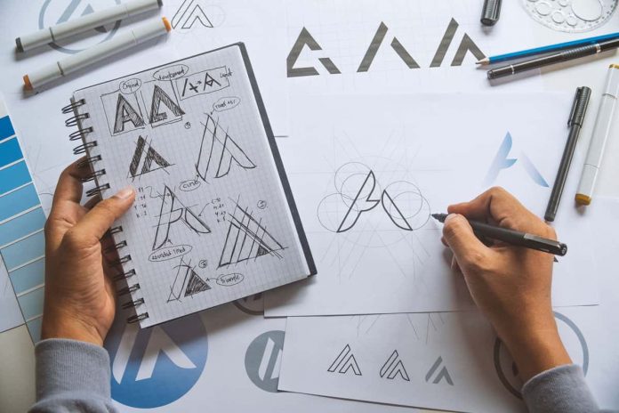
Logo designers must always first try working black and white. Don’t always jump into colors, gradients, and similar things because the designer gets lost. The designer has to first focus on the ID that is why it good to focus first on black and white because you can look at the details and see what is working and what is not working for the logo. Again I would emphasize that the designer has to make sure you are designing the logo that is for the target and according to the client’s brief. So always work in black and white first because it can help you in real composition and help you design the best logo.
Avoid effects
most of the logo designers create crappy logos that don’t put job shadows, glows, gradients, strokes, boxes, etc, and make it over complicated. Again I repeat that you have to keep the logo simple, professional, clean, and minimal. But it depends on the type of customer that wants to design a logo like for example for a video game company you can create playful logos and use some effects. But when it comes to designing a logo for business or brands or corporate clients then make sure that you avoid using a lot of effects.
Typography
All the companies have logotype or typography that they use within their brand voice, style, or in their writing and in every way that they use it. They have a logo and they have a type. It is important to pick and choose the right logotype. You have to pick the one that reflects your brand’s principles and values.
Color
Different colors evoke different emotions. So you have to pick the right color. For example, the logo of the McDonald red and yellow color is used which is said that they together show an increase of appetite so it makes you go and buy some burgers or chips and eat. So that color has to be chosen for a particular purpose and not just because you like it because it is about your target audience. So have to think about whom you are designing for.


